Destination Insights
Leveraging 3.5 billion Visa cards in 200+ countries & territories, Visa Destination Insights (VDI) is an analytics platform that collects domestic and international spending data for the tourism industry at both the private and government levels.
COMPANY
Visa
DURATION
8 months
YEAR
2023
ROLE
Redesign

Role
Leading platform-wide redesign
Organizing/optimizing our Figma workspace (recent migration from Sketch)
Challenges
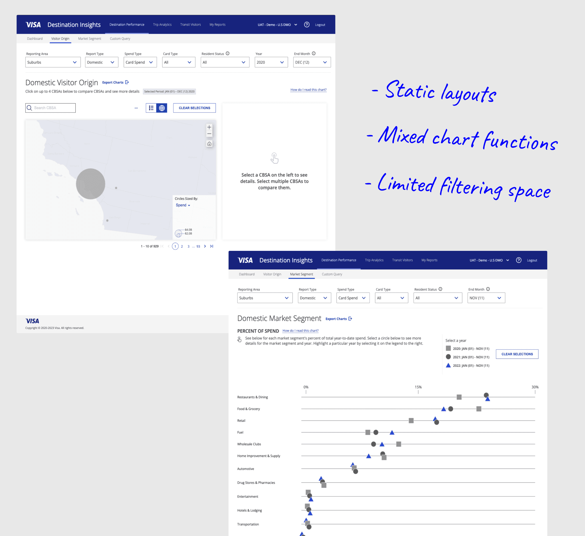
VDI was using a mix of several outdated Visa design systems in addition to a large amount of custom UI, creating a lack of consistency across...
Navigation
Page Layouts
User Actions
These issues were compounded by the fact that implementation was handled by a 3rd-party dev team who could not utilize native Visa design assets (all UI were built from scratch while simply mimicking the look and feel of our designs in Figma)
Opportunities
All of these challenges pointed to a lack of standardization in 5 levels:
↳ Project & File Structure
↳ Information Architecture / Navigation
↳ Page Layouts
↳ Components & Data Visualizations
↳ Implementation
I hoped to use the VDI redesign as a test-bed for developing best-practices that could benefit other designers, their projects, and eventually scale up to our global design system.
Solutions
★ Project & File Structure
In-file annotations clearly describing flows and screen groups
Pages separated UI by status (archived/explorations/dev-ready/developed)
ToC linking out to all design files + macro project view of flows
Discoverability (links to and from external resources like wiki pages and task-management platforms)

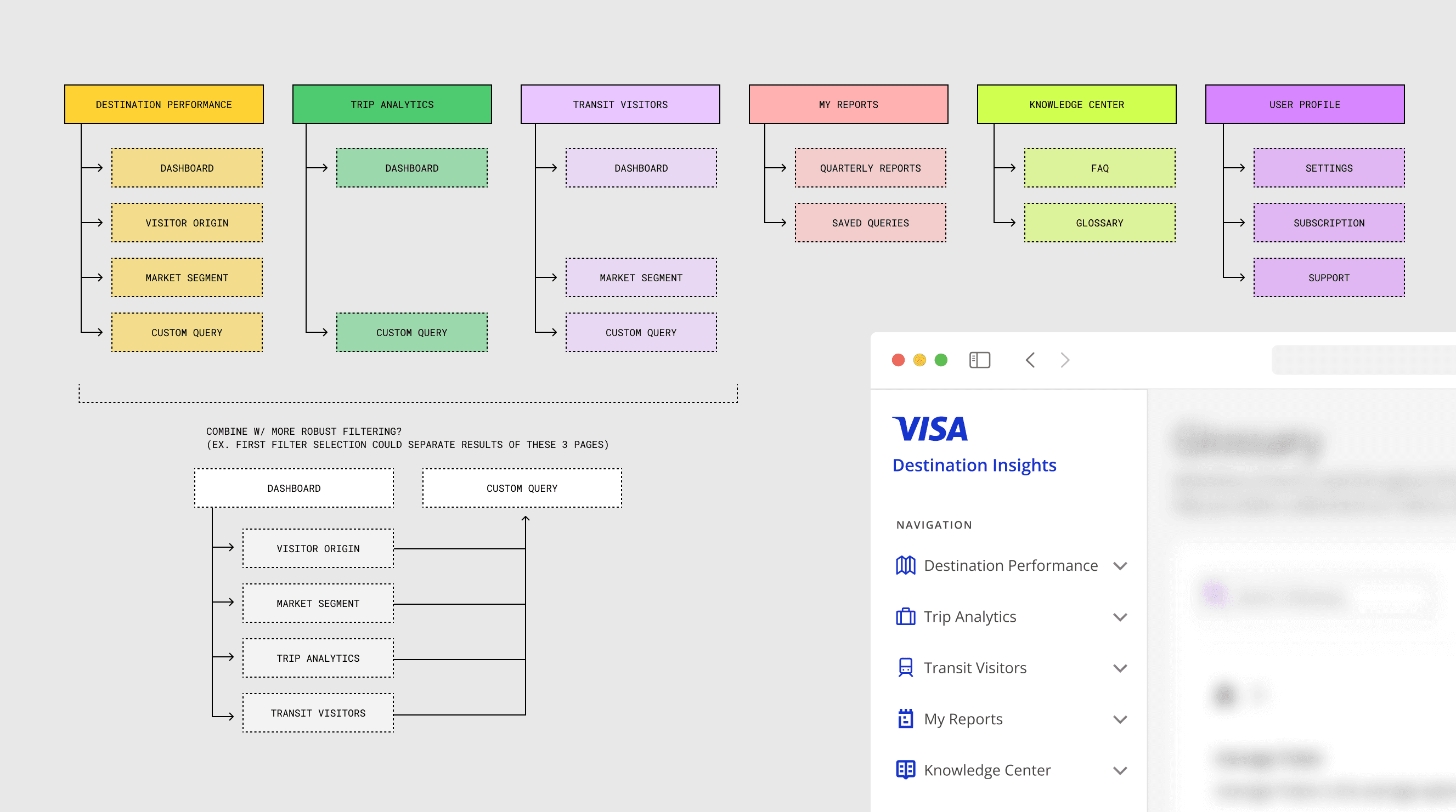
➜ Information Architecture/Navigation
By mapping out redundant screens and user actions, we were able to consolidate VDI's most important functionalities. This reduced both the total pages and the need for cross-page travel in our user-flows.
✎ Page Layouts
Standardizing our page layouts ensured that multiple designers could work in different areas simultaneously while maintaining consistency, as well as reducing the amount of unnecessary layers and Auto-Layout complexity
We created a simple Figma 'Frame-Anatomy' guides to help us establish:
Which layers should we apply sizing properties (ex. Constraints, Auto-Layout, Row vs Column)
Which layers should we apply content-spacing, margins, and padding for scalability across pages
What layouts enable us to edit and prototype more efficiently?

One level up from frame-anatomy, we consolidated larger UI patterns across pages, wanting to reduce both user-onboarding time and the amount of page-specific design decisions we had to make:
Modular tile-based layouts that are content + screen-size responsive
Dynamic multi-column layouts to reveal secondary items such as filtering menus and expanded info sidebars
Navigation patterns (ex. what page levels to present navbars, breadcrumbs, tab menus, and anchor link menus)
Filtering patterns (ex. how it interacts with in-page contents, and if/when filter selections can persist across pages)

❖ Components & Data Visualization
While moving VDI to the most recent Visa Design System assets, we also built out a local design system specific to VDI.
Using atomic design principles, we were able to create a system that balanced the strengths and weaknesses of local vs global design libraries.
By nesting global design library components (ex. icons, buttons) inside of more complex project components (ex. content cards, menus), we could keep components connected to the main library while also allowing for customization using local overrides.
Creating prototype-ready components at the project level allowed us to create prototypes spanning multiple flows

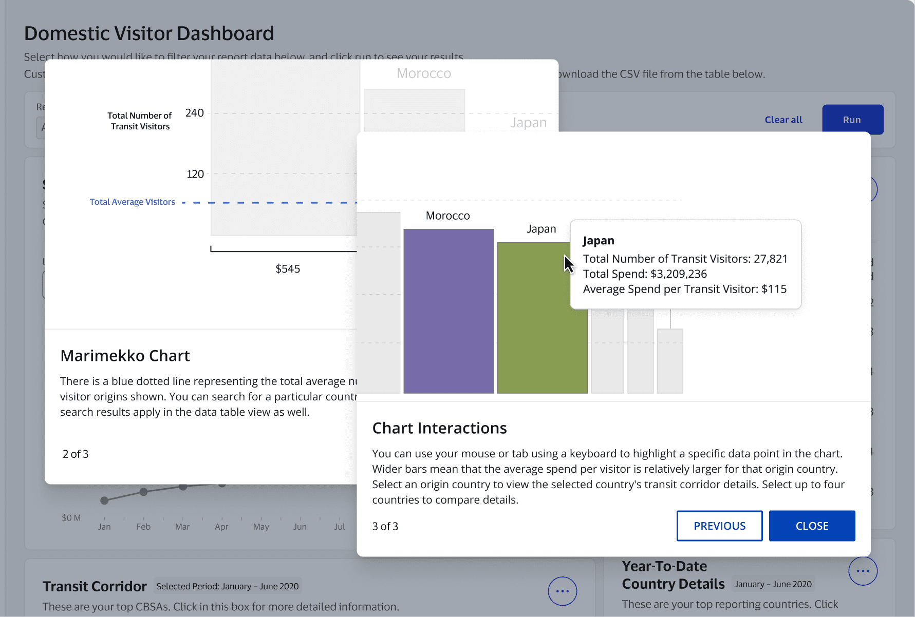
Local components helped us standardize chart interactions such as toggles, menu options, and sizing behavior
Previously working with static images of data visualizations, I rebuilt all of our available charts from scratch in Figma that are both sizing and content responsive (which would later contribute to Visa's Data Experience design system)

► Implementation
Hoping to work more directly with the dev team moving forward, we setup Figma onboarding sessions to get them comfortable with collaborating in the design file (ex. commenting, tagging, inspecting UI, prototypes).
Learning more about Figma also helped developers understand why we created screens/layers in certain ways, and how we can translate those ideas on the frontend.
(ex. mimicking the responsive sizing behavior of Auto-Layout in Figma to Flexbox on the frontend)
We also setup dedicated Figma files for the dev team including…
Red-lining
Accessibility annotations
Live-Site QA Testing

* Misc. Updates (2023)
User Onboarding
Standardizing how we educate users on complex filtering and data visualizations, including hover/click/keyboard interactions, and how to draw key information from each chart type
5. Privacy & Transparency
With previous Cookie Consent banners hiding information behind separate URLs, we introducing expandable info and customizable consent options, allowing users easy-access to what information is being shared, which are required, and why.
