Iota Design System
Iota is a Figma-based design system that aims to improve the ease, efficiency, and scalability of designing user interfaces.
COMPANY
Falmouth
DURATION
1 year
YEAR
2024
ROLE
M.A Final Project
Design tokens
(Figma variables)
Rather than defining a traditional style guide, I developed iota using a design-tokens system. Design tokens allow iota to be easily customizable, consistent, and scalable.
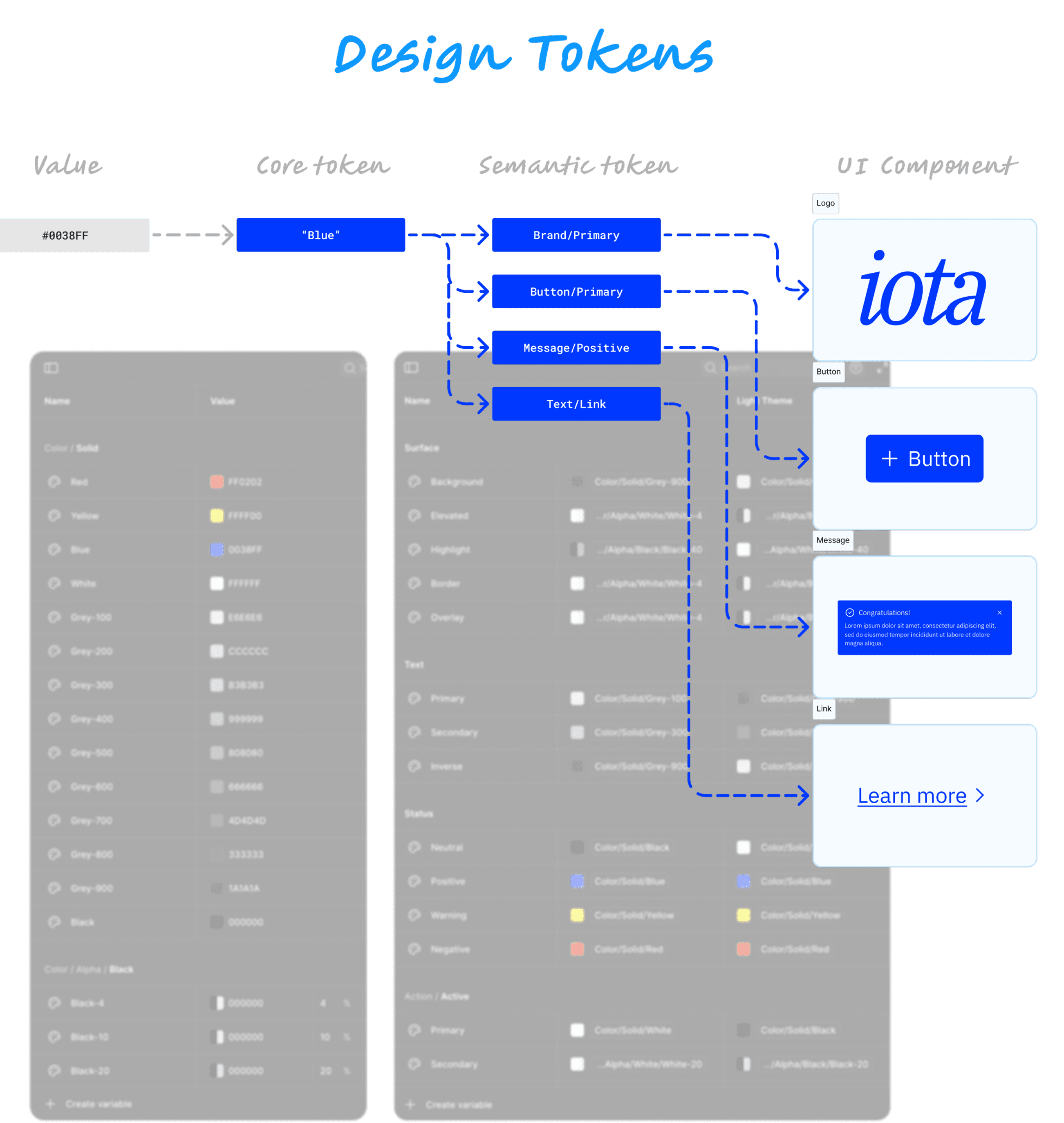
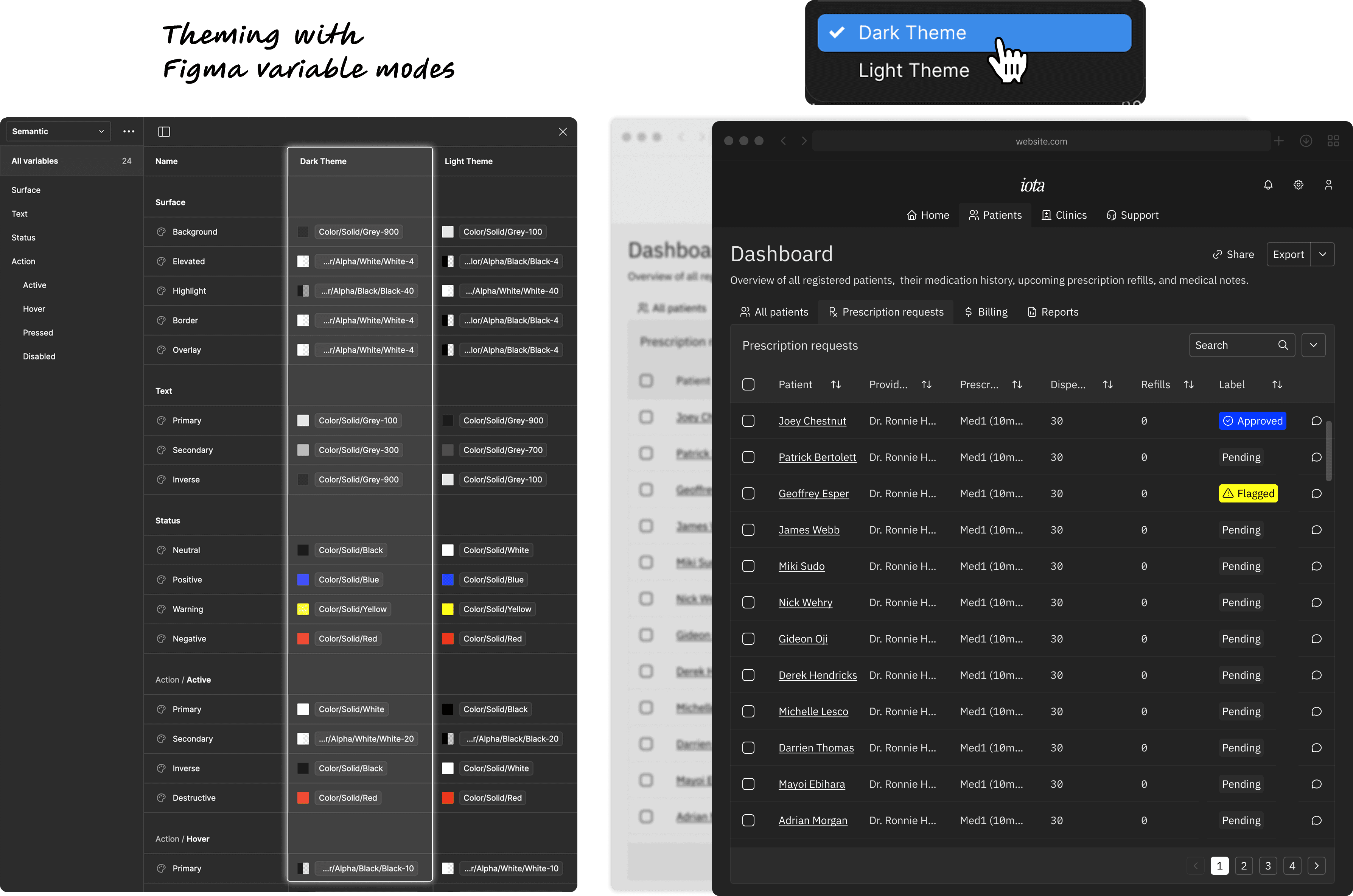
Color
Multiple values can be assigned to a single design token via 'Modes' in Figma. This allowed me to create separate themes for light/dark modes, as well as giving me the ability to add more in the future for product/brand specific color palettes.
Typography
Iota features separate tokens for the design system’s Serif, Sans-Serif, and Monospace fonts, allowing users to swap out entire font families while preserving existing typography styles.

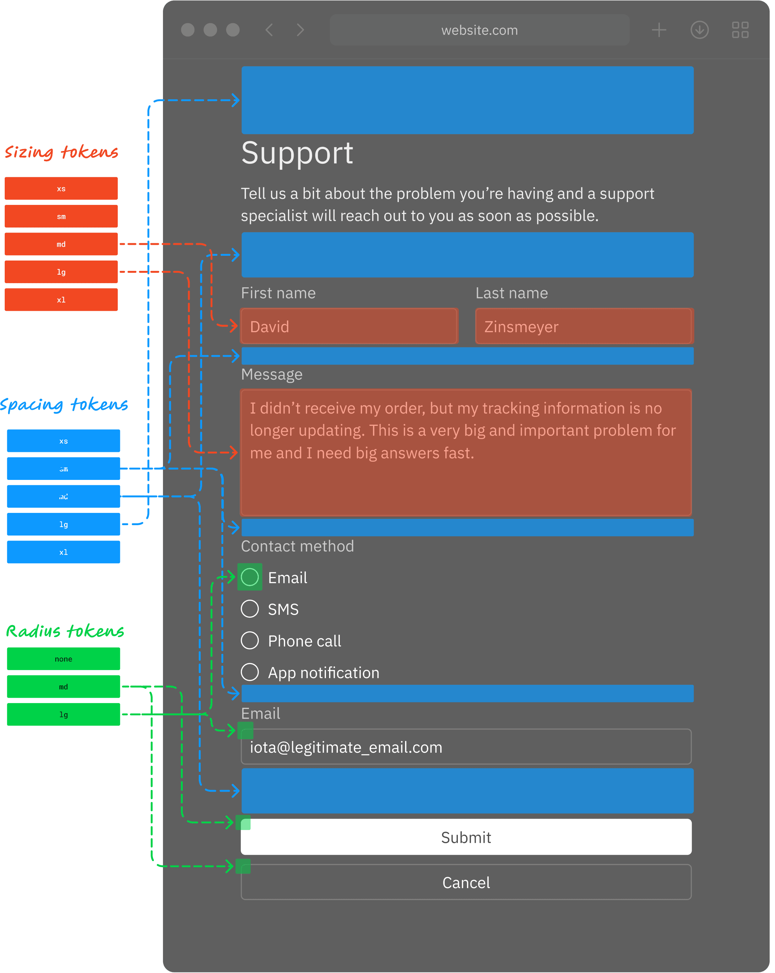
Measurements
By creating a set of 'Measurement' design tokens, designers can more easily standardize components and layouts using predetermined Sizing, Spacing, and Radius values.
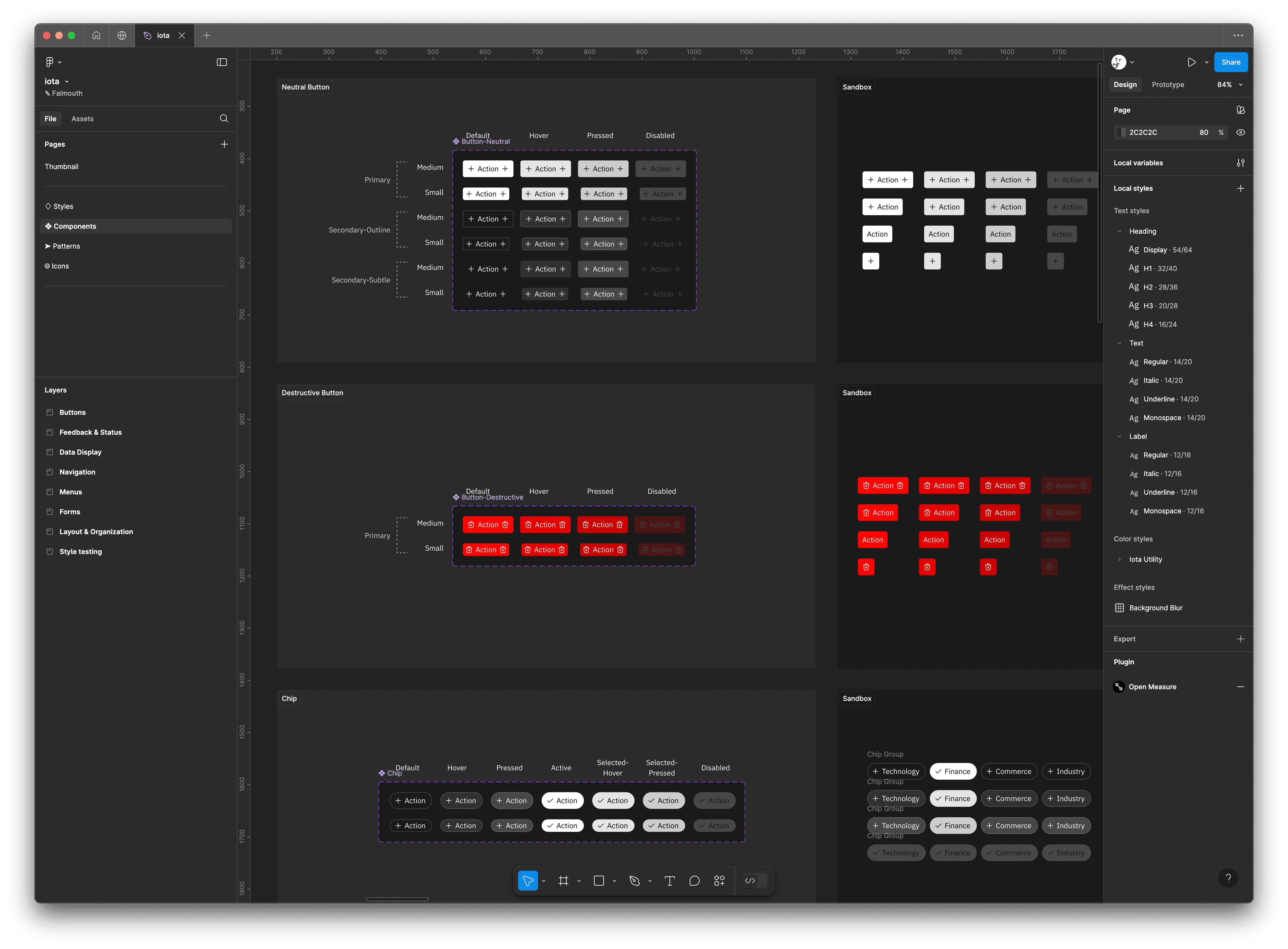
Component library
Iota’s namesake is to emphasize the design system’s atomic design structure. Instead of building each UI component separately in a vacuum, I planned my workflow around designing the smallest most granular UI components first, and gradually nested them into more and more complex elements.
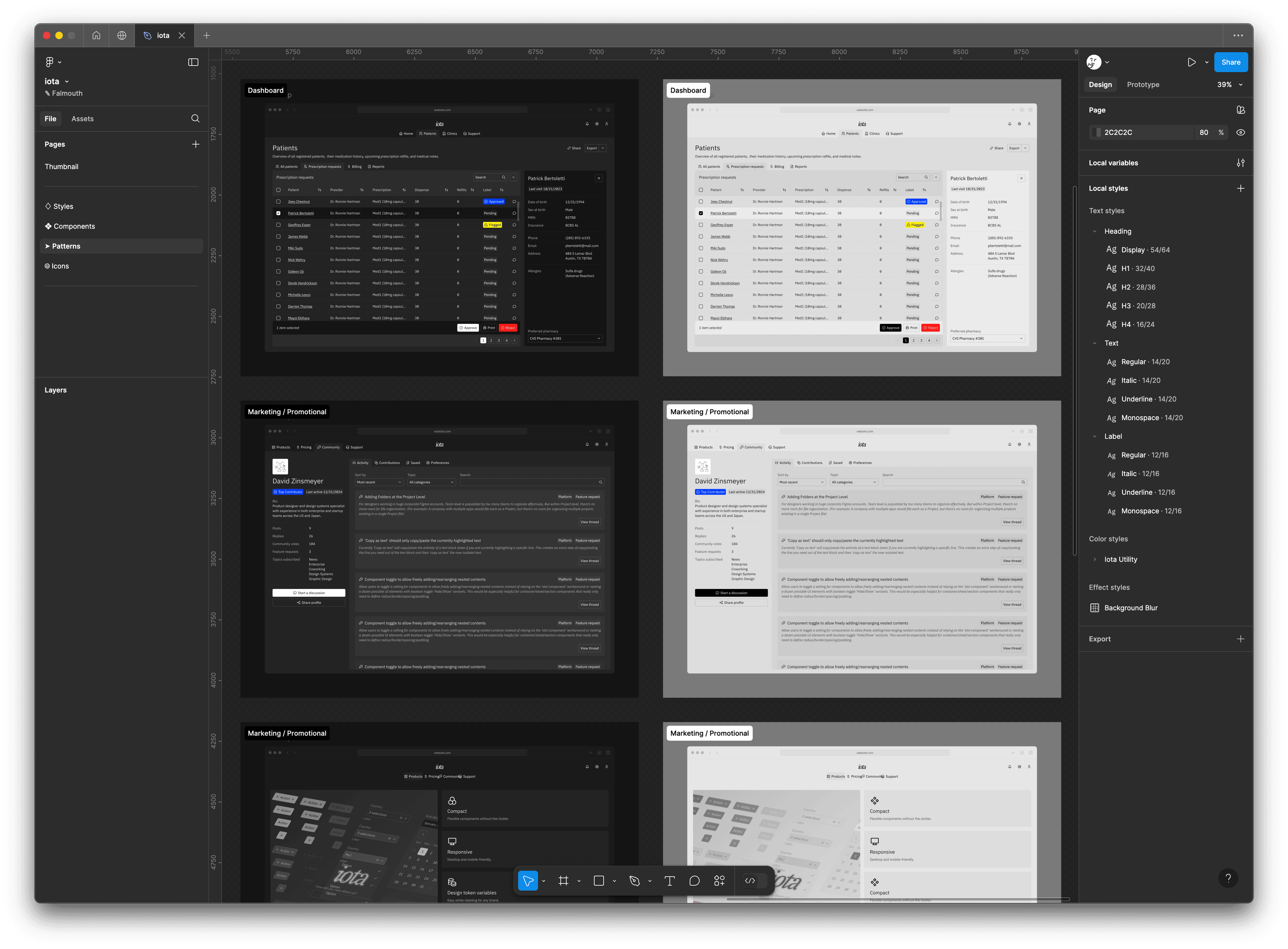
Patterns
To both reinforce Iota's best-practice guidelines and provide boilerplate UIs for new projects, I created a collection of common page and application examples. This also allows users to test colors, components, and sizing values holistically in the context of actual user interfaces.
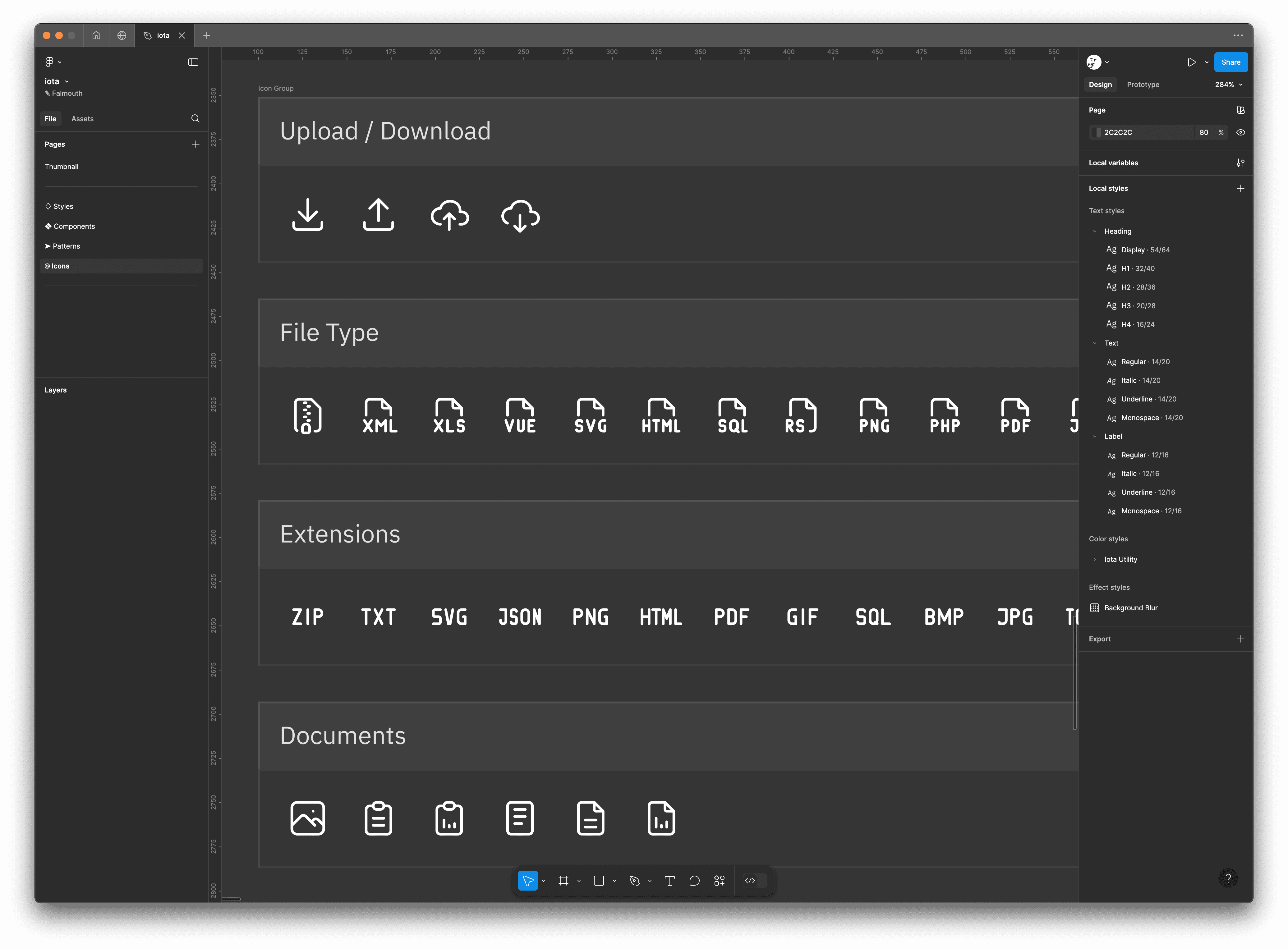
Icons
Lastly, I imported Tabler icons as the default icon library for Iota. I organized each icon into sections for each theme/function. These sections also group icons together in the context of Figma's asset panel, which helps designers search icons more easily.