Overview
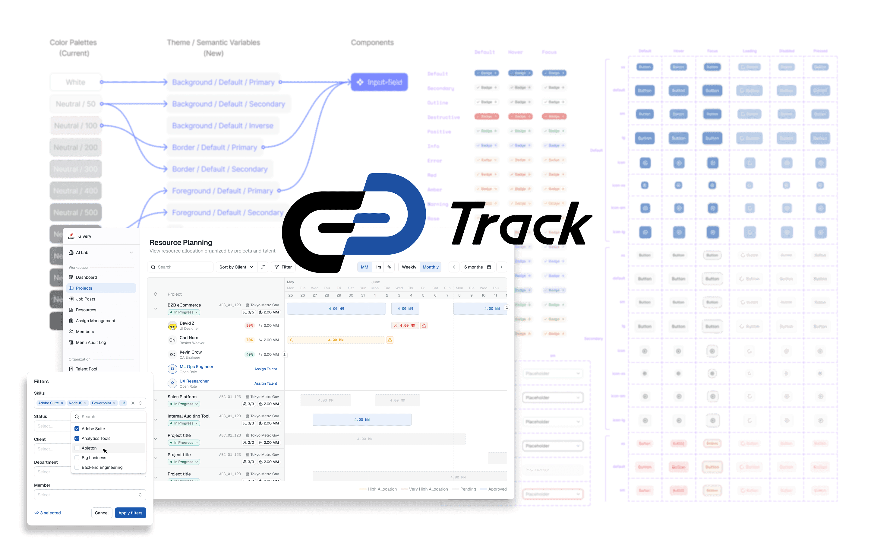
Track is a suite of white-label HR products that support organizations throughout the employee lifecycle, from AI-assisted recruitment and technical assessments to skill development, and project allocation. As the platform expanded, each product evolved independently, resulting in a fragmented user experience and duplicated design+dev effort.
I joined the team to establish our first shared design system while also committing 50% of my bandwidth to product design support.
Challenge
Givery already had something they called a "design system" that lived solely in Figma, but it acted more as casual asset-sharing space for designers working across different products.
Each product team operated largely independently. Developers implemented their own version of a component in Figma from scratch, without any clear guidance or oversight to ensure Product A's version of Button-Primary looked and behaved identically to Product B's, and if they were built in a way that allowed sharing between products.
As a result:
inconsistent UI patterns across products
duplicated design work
duplicated frontend implementation
inconsistent component behavior
no shared source of truth between design and development
My Role
I was responsible for introducing scalable design system practices into the existing product ecosystem while continuing to support product feature designs.
Establishing a shared foundation
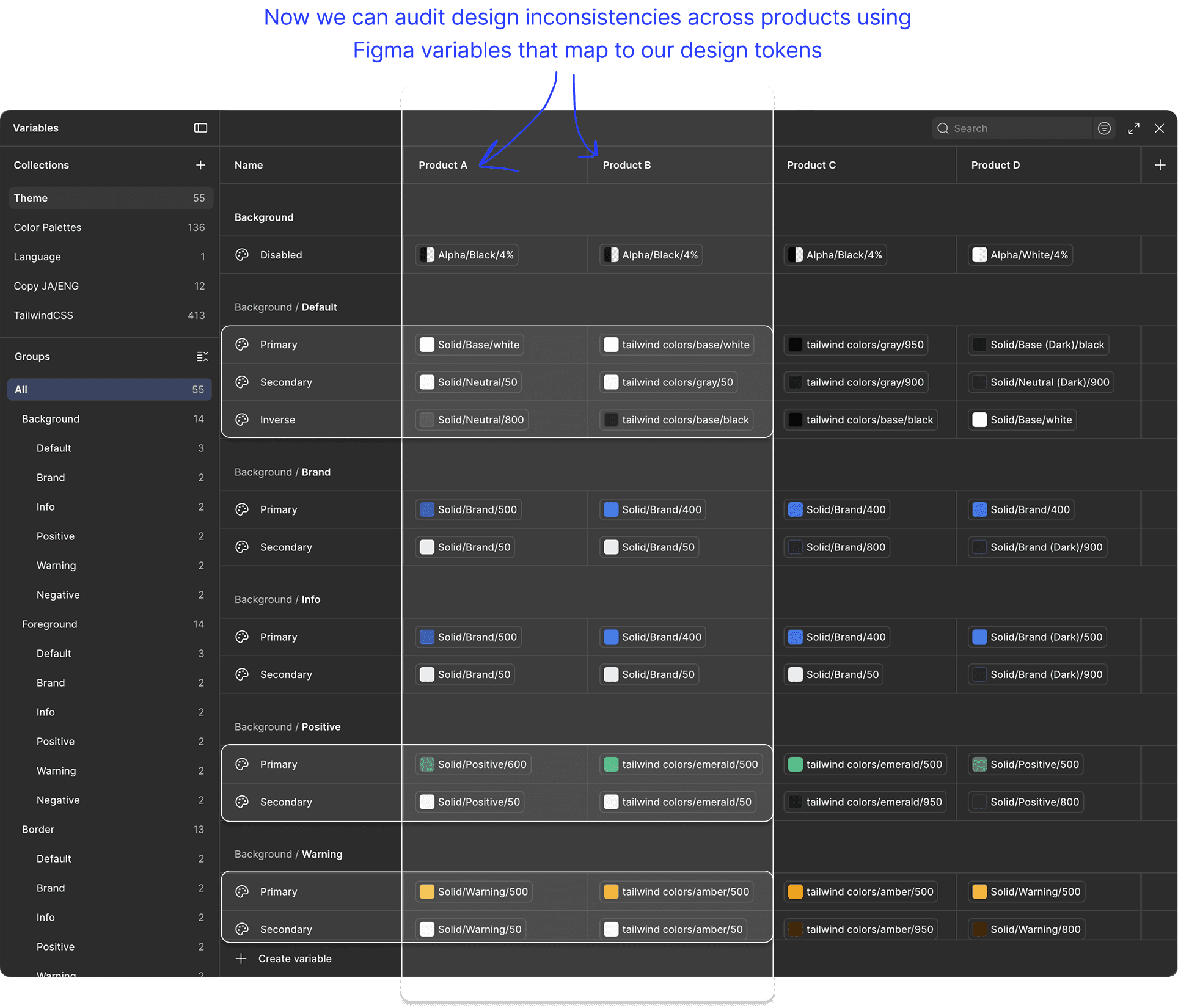
Designers collectively referenced a set of brand color palettes. You couldn't easily audit Track products for UI design inconsistencies without directly comparing each product's UI and against each other.
Why do some designers use the color
Neutral-800for text, and some useNeutral-700, and some useNeutral-600…
Rather than making lengthy documentation (and hope someone reads it) or directly policing other designers' work, I established a structure of semantic design tokens that would alias the original color palette values, but give a clear indication of their intended usage. Designers could always break these conventions if their product work called for it, but I wanted to make sure the decision was intentional.
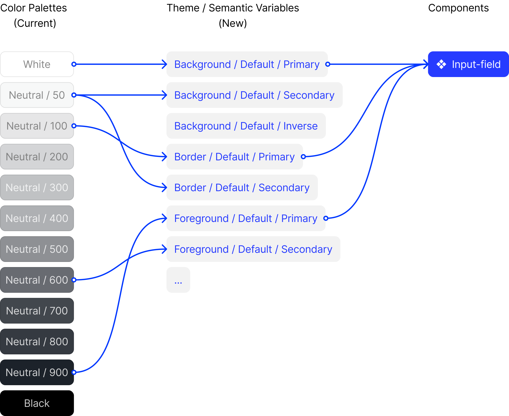
For the long-term scalability of the system, I had to structure the tokens in a way that was specific enough to inform proper usage in the UI, while also keeping them broad enough to apply to a range of UI elements without the risk of needing to add additional component-specific tokens in the future. I sorted tokens into the broad Background , Foreground , Border , and Interaction (things like hover & focus states), and further organized into subcategory and modifier layers as shown below:
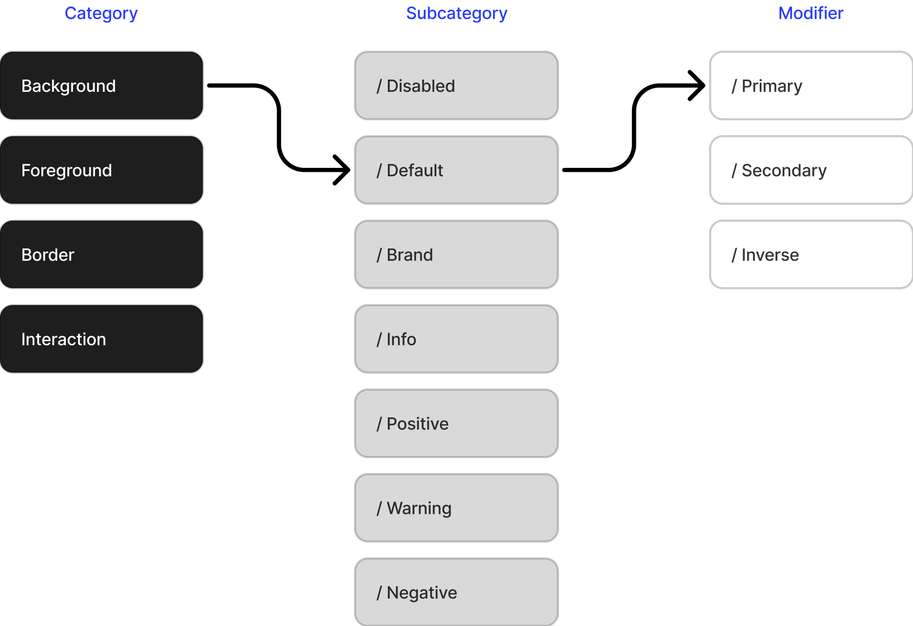
This provides several advantages:
takes the guess-work + decision-fatigue out of design process
frontend teams share identical styling values
future rebrands + light/dark mode theming become significantly easier
individual product teams can work independently while maintaining consistency
Auditing the Existing Products
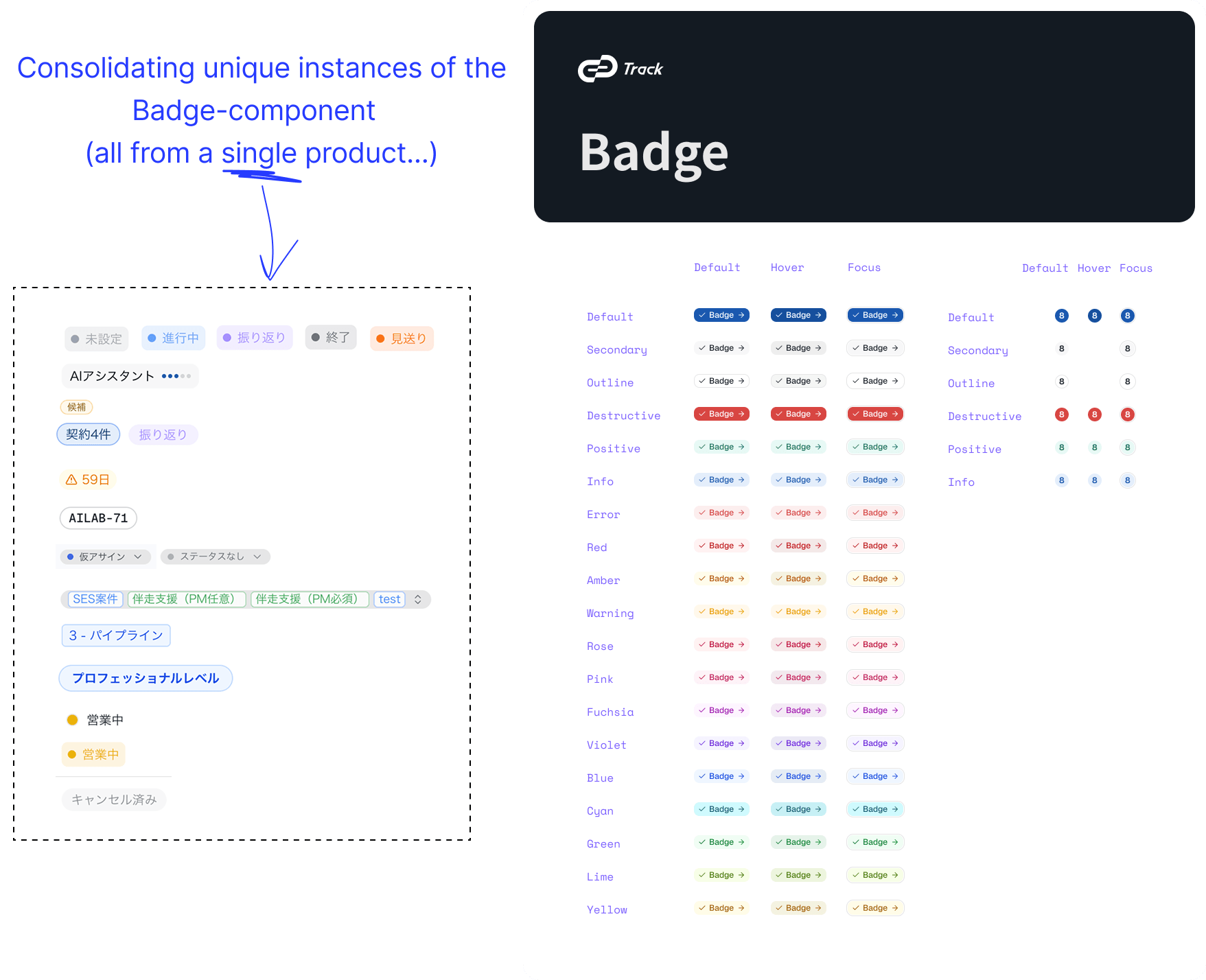
Once we had a shared language across products in our design-tokens, I could begin measuring inconsistencies at a high-level.
We could now compare every interface against the same design language and identify opportunities for consolidation.
Aligning Design with Engineering
Asking devs on each product team how they currently work with our design system, I discovered most of our dev teams were unofficially using Shadcn (a frontend UI library) to implement our designs.
Rather than designers creating components in a vacuum, and developers translating those designs to frontend using an approximate matching Shadcn component, I used Shadcn directly as a reference point to align:
component taxonomy
naming
expected behaviors
states
availability
This reduced translation between design and implementation while making the system feel familiar for developers.
Building the Component Library
Because we had no dedicated resourcing for a design systems team that operated above the individual products, I needed to structure design system updates in a way that could be adopted in bite-size chunks by each individual product team depending on their capacity.
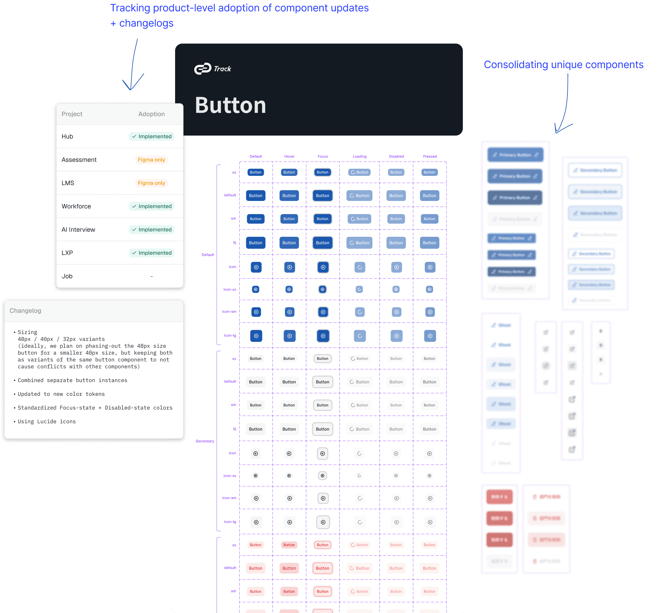
With product-team designers giving me their priority rankings for new/updated components, I roll out updates one component category at a time, providing changelogs if an update to existing components, and a cross-product adoption tracker that each designer helped maintain.
Putting the System to Work
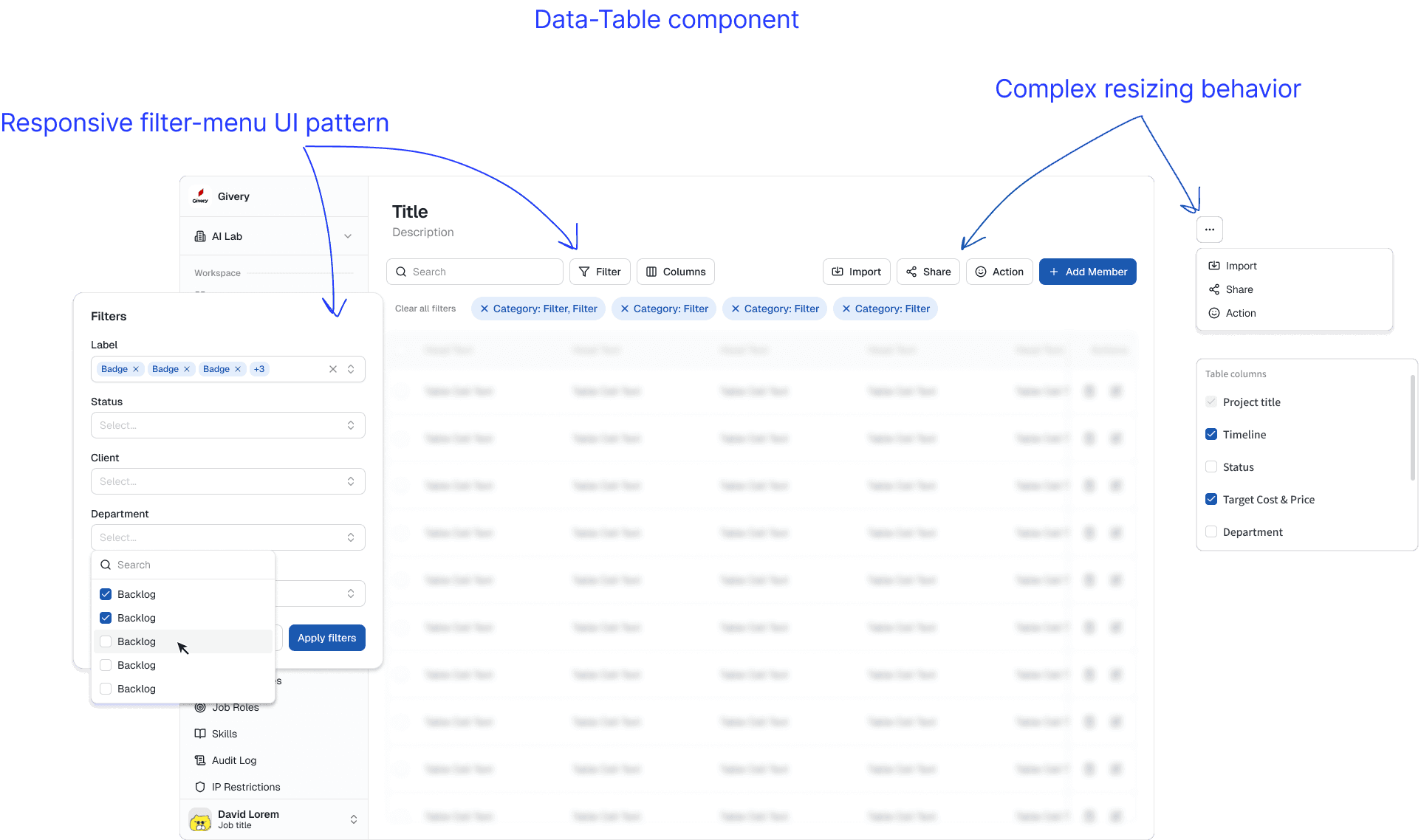
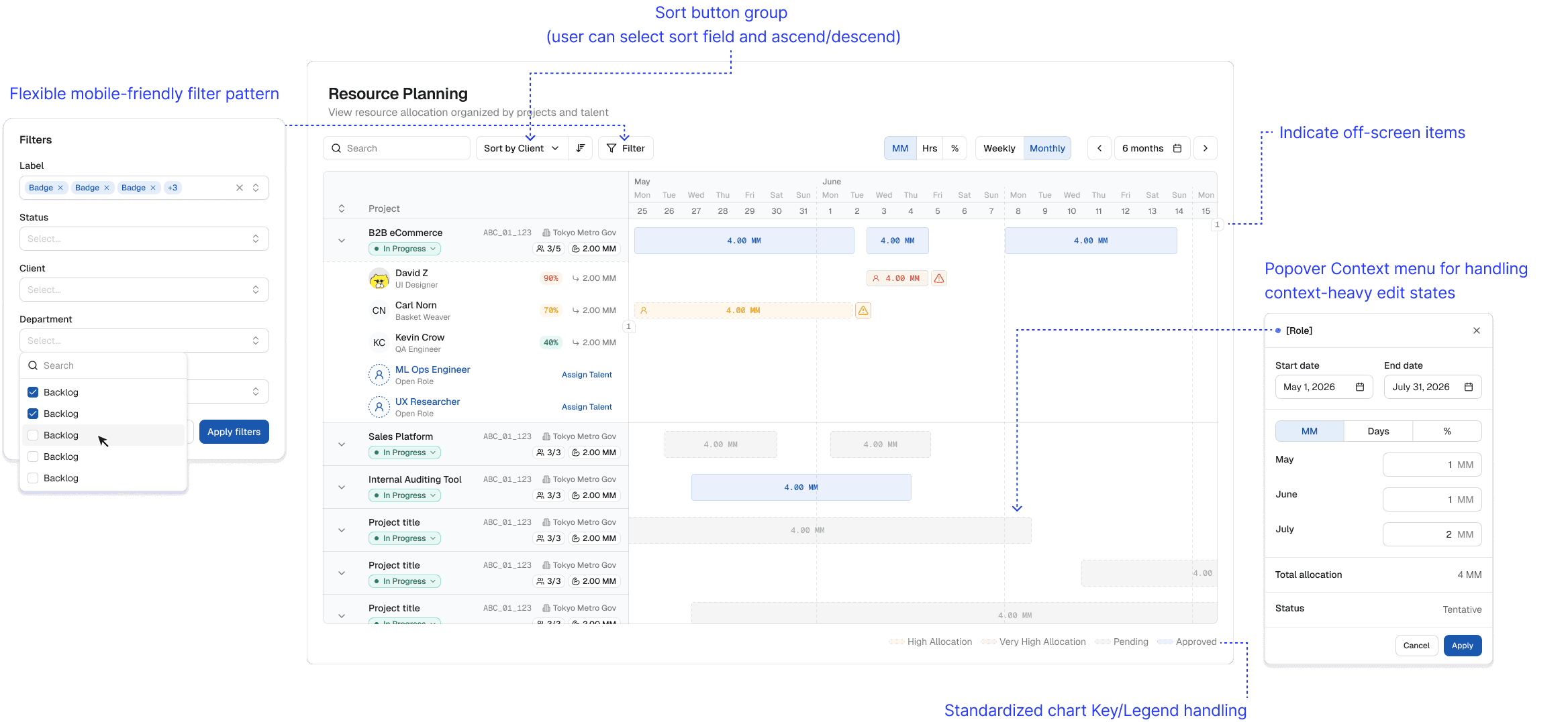
Split between design system and product work, I was able to directly test and validate my own design system improvements before pushing changes to the broader team.
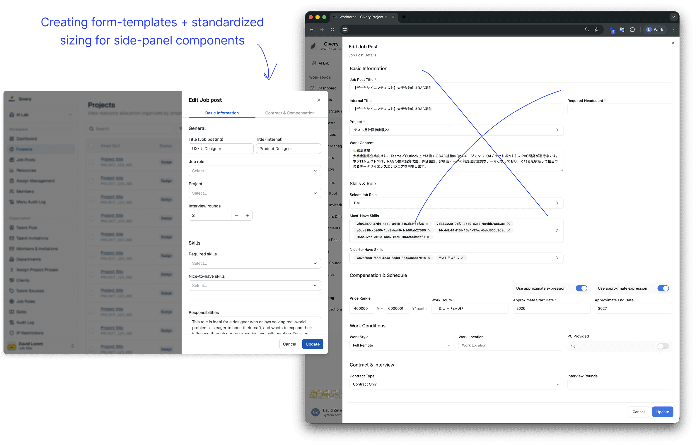
Rolling Adoption Across Teams
Over the past year we have progressively introduced new foundations and components as products evolved, allowing teams to adopt improvements alongside regular feature work instead of through large-scale redesigns.
Results
Design:
Shared design tokens across products
Unified icon library and standardized guidelines around custom contributions
Reduced UI inconsistency
Improved component reuse
Engineering
Better alignment between Figma and frontend implementation
Shared component vocabulary
Reduced interpretation during handoff
Organization
Easier collaboration across product teams
Foundation for future scaling
More consistent customer experience across the Track ecosystem
Reflection
In my previous design systems experience at Visa, I had a much more focused singular role in designing UI elements for the design system. However, this was the first time I really had to own the end-to-end strategy from aligning the design team to managing comms with product-teams, and working with devs for handoff.