Rakuten Link
The exclusive messenger and dialer app of Rakuten Mobile's 3 million subscribers, LINK acts as a unifying super app for the Rakuten service ecosystem.
COMPANY
Rakuten
DURATION
1 year
YEAR
2022
ROLE
UX/UI

Overview
The Rakuten Link app serves as the default messaging and calling app for Rakuten Mobile's 3 million subscribers. With a large service ecosystem including e-commerce, travel, video-streaming, banking and sports, Rakuten was interested in the concept of developing Link into a Super-App.
/ super-app /
A mobile or web application that provides multiple services including payment and financial transaction processing, effectively becoming an all-encompassing self-contained commerce and communication online platform that embraces many aspects of personal and commercial life.
Notable examples of super-apps include Line (Japan), Kakao (S. Korea), WeChat (China)
With so many service integrations planned for Link, it was important for our UX/UI team to create a scalable UI that could accommodate dozens of separate Rakuten services while also not losing focus on the core communication functions.
↓ my design contributions ↓
Design Systems
Multiple Phone # Feature
Mini-App Integrations
1. Design Systems

Hoping to address UI problems at the design system level before digging into project-specific challenges, we Identified the following issues with the current design system:
Control
Managed by an external team, Link designers would need to officially request/petition for new or updated components, with a lengthy approval process that encouraged designers to adopt their own local component systems.Redundancy
Default/Active/Hover states were often created as separate design assets, multiplying the overall size of our libraryUnresponsiveness
Components did not utilize Figma sizing properties such as Constraints and Auto-Layout Fill, resulting in designers immediately disconnecting components from the library in order to make manual size changes.
With most of our UX/UI team coming from UX Research focused backgrounds and relatively new to Figma, I led conversations in identifying inefficiencies in our current design system and how we can build it better.
Unified
By organizing component libraries, styles, and "master files" under a single project, we added a layer of intention to our design process. When updating designs in one area, we make the conscious decision whether or not that needs to be applied to the other areas as well (ex. Is this change OS specific? And if so, does it need to be? ) This was my strategy for preventing a diverging design system for Android and iOS. I am a big proponent of OS-agnostic design systems and a design system more tightly consolidated across OS is more agile and scalable, and manageable for a relatively small design team.
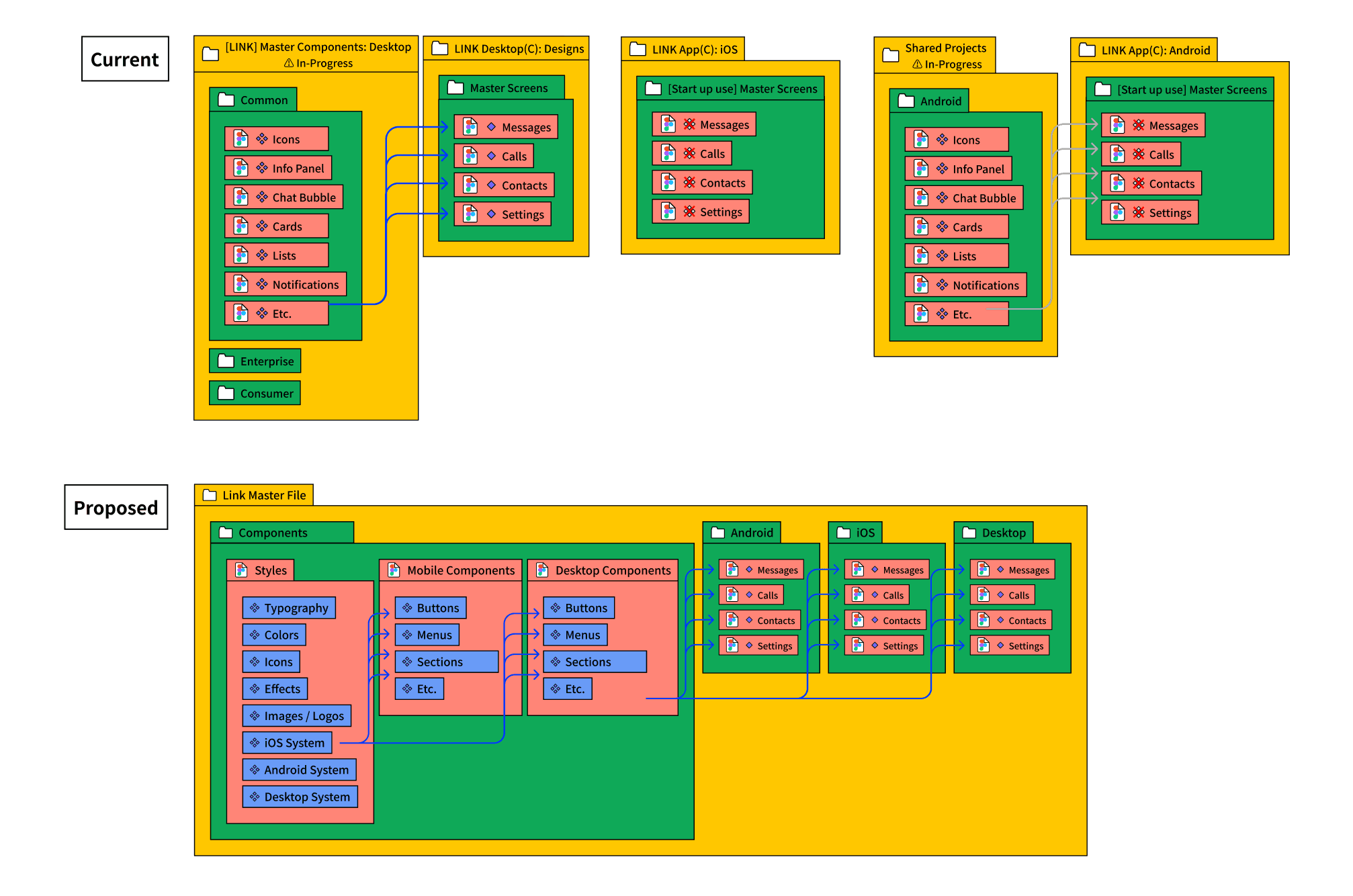
Responsive
Through Figma's Auto-Layout and Variant features, we were able to consolidate dozens of separate design assets into single components that were both content and screen-size responsive.

Maintainable
By creating components from the smallest possible assets (text, icons, buttons), and gradually nesting them in more and more complex components (forms, lists, menus), we were able to create a modular system that would only require updating a single component to cascade that change to every related design asset.

2. Multiple Phone # Feature
Function:
Users can generate multiple 'virtual' phone numbers tied to their main SIM account with Rakuten Mobile, all within the context of a single account in the Link app.
Our first task was translating this project to a Japanese market where few users utilized multiple phone numbers. After workshopping with our Japanese designers, we defined several use cases that were relevant to almost any Japanese user:
Unsolicited sales calls
Work contacts calling after hours
Use Case:
Secondary Number for Spam Calls
In any situation where you are required to provide a phone number (ex. shopping receipt, hotel reservations) a second virtual phone number can serve as a filter for spam and marketing calls. Users can mute incoming calls from their 'Spam' phone number while not worrying whether or not they are missing calls from friends and family on their primary number.

Use Case #2
Secondary Work Number
For the unfortunate situation of having a single device for both work and personal contacts, separate phone numbers can help you fully disconnect from work at the end of your shift.

There were a number of tricky UX challenges that came from multiple phone numbers interacting with the same app-contents. However, by cleanly mapping our calling/messaging scenarios in Figma, we were able to open up these complex dependency conversations to the wider team.
Assigning a Default Phone Number to Contact

Contact Default #'s vs Manual User Selections

///////////////////
2. Mini-App Integrations
Our strategy for integrating Rakuten’s growing service ecosystem into Link is through Mini-Apps, which are HTML/JS/CSS web-apps displayed in a rich webview interface within LINK.
These mini-apps can be found on the Link Wallet tab (Rakuten Banking, R-Edy, R-Points, and R-Pay), and the Discovery tab (online shopping, news, TV-streaming, horse-racing, etc.).

Hoping to bring the functionality of mini-apps into Link, we developed mini-app based widgets to provide user's most frequented mini-app functions to a central space. Widgets could include utility-oriented apps like Rakuten Pay or games to populate the space for more casual users.